Jostle Design System
A force multiplying system used by the Jostle’s Design and Dev Teams.
Objective:
Enable the Design, Dev, and Marketing Teams to create, replicate, and assemble consistently.
Design
Justin Alm
Grey Vaisius
Noel Heaney
Elliot Mah
Dev:
Grey Vaisius
Justin Alm
Status:
In production

Note: July 2017, we presented this to the entire team at Jostle. This piece is an adaptation of an article I cowrote with Grey Vaisius at Jostle, which we posted to our internal Jostle intranet for existing company and new hires to reference.
The problem
As the Jostle Design Team grew, we developed greater need for shared principles and rules for measuring the success of our designs. When I arrived at Jostle, the product was filled with a variety of font-sizes, capitalization treatements, 500 shades of grey, and a seemingly infinite number of spacing units. Given the size of the product landscape and our lack of rules, we found it difficult to evaluate each other’s product design. Nothing was technically right or wrong.


The solution
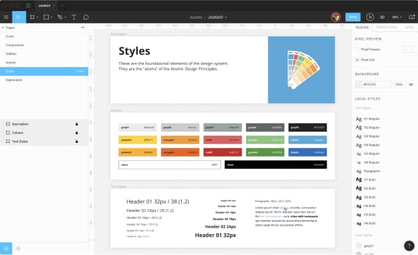
We created The Jostle Style Guide (Style Guide) to define the rules and pieces of our design system—collected and codified in a single place. The Style Guide originated with Justin Alm, Grey Vaisius, Noel Heaney and was created to meet the need to have a easy way to replicate and assemble consistent design deliverables.

Justin Alm

Grey Vaisius

Noel Heaney
The foundation of The Style Guide was a set of extremely basic building blocks: colours, a defined and flexible typographic hierarchy, spacing units, and a few practical use elements (form elements, dividers, buttons, etc.).
We used a naming convention and methodology inspired by Brad Frosts’ Atomic design. This was an extensible approach to us, allowing us to stop at a small set of building blocks (atoms) or logically expand to modules (molecules) and further into layouts (organisms) if so required.

Having a single point of reference helped us find answers to questions regarding style and enabled our team of independent people conceptualize, design, and build products that felt like variations on a cohesive theme. When cohesion or integration issues arose, there was a clear point of reference to trace back to. This point could be modified or extended and all future projects benefited from the expansion.
Our system became an entity in the organization and identifying and discussing inconsistencies became easier. The benefits of the Style Guide extended beyond our internal experience of designing and building products. As the principles and rules of the system were applied, the experience people had in the product also became more consistent, stable, and enjoyable.
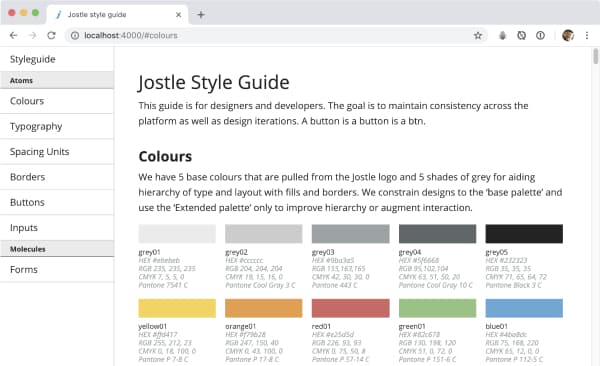
Colour
We primarily used 5 colours. These colours were pulled from the Jostle logo. We also had 5 shades of grey.

As our brand and identity evolved, we extended our colours to enable more expression in blog images, online ads, and gated pieces of content. We considered it best practice to constrain new designs to the primary colour palette and we tried to use the extended palette only when needed. Although we initially extended the colours for use on the marketing website, we found these darker hues to be useful in product design as well.

Extended palette applied to marketing collateral.
We used our of greys to bring focus within a Primary View. In the product, the view hierarchy moved from left to right and dark to light. That said, we did run into instances when we had to break our rule of “dark-to-light” in order to maintain contrast within a view. That was especially true when our customer’s brand was applied to the product. At that point, we did our best to constrain the application of colour but it was up to the customer to make the best of the tooling we offered.

Typography
Across our product and marketing materials, we used Open Sans by Steve Matteson. Open Sans is optimized for print, web, and mobile interfaces, and has excellent legibility characteristics in its letterforms. We used the Regular (400), Regular Italic (400), Bold (700), and Bold Italic (700) weights in Jostle’s UI.
Most type within the UI was set at a font size of 14px with a line-height of 1.6. That font size struck a balance between legibility and efficient use of screen real estate. For longform reading, such as chat Timelines or the body of an Article, Event, or Classified, we used a 16px font size to improve the reading experience. Links were blue and underlined. When you hovered over a link, the underline was removed. We used pixels because it translated easiest into our design software. When it came time to vertically integrate sizes into the product, we would transpose values from px to em or rem.
Generally speaking, we used larger or bolder sized type to indicate a new section of content or controls. For example, the font size for a title of a form was styled larger than the font size of an input label. The largest type in our application was 32px and the smallest was 12px. By default, headers were regular weight but could be bold.

Spacing units
We used larger spacing units to delineate sections of content or controls. Smaller spacing units were used to space elements that made up a section of content or cluster of controls. For example, the padding for the container of a view was often larger than the margins between an input and label. To keep consistent padding and margins on elements throughout the application, we used spacing units divisible by 8 (i.e. 8px, 16px, 24px, 32px, and 40px). This helped us maintain consistent vertical and horizontal rhythm throughout all of the components that made up the UI.

Borders
We considered it best practice to build hierarchy within a view without borders but if you required another element to delineate a block of content or set of actions, they could be used. Most of our borders had a border-width of 1px. Our Fat-light border was 5px wide and was used sparingly.

Borders
We considered it best practice to build hierarchy within a view without borders but if you required another element to delineate a block of content or set of actions, they could be used. Most of our borders had a border-width of 1px. Our Fat-light border was 5px wide and was used sparingly.

Buttons
We had 3 classes of buttons: Neutral, Destructive, and Confirm. Each class of button could be disabled. The hover and active states for each class stepped 1 colour darker in the palette. For focus states, we applied a 2px border using the darker hue in the pallet. All buttons had a border-radius of 4px.

The size of buttons and input elements was determined by the font-size, line-height, and padding of text within the button. For most of our buttons we used “font-size: 16px/1.5; font-weight: 700; padding: 0.5em 1em;”.

Inputs
All inputs had a solid, 1px, grey02(#ccc) border and their corners were rounded with a border-radius of 4px. We labelled all of our inputs top-left using a bold 14px font. Placeholder text was for directing the user by example and was coloured grey03 (#9ba3a5). Some data required a character limit so a counter was placed above the top-right corner of the input. The input’s focus state had a blue 2px border. The input’s disabled state had a light-grey background and the CSS property “cursor: not-allowed“.

Relative sizing
Inputs were also proportionally sized by the font-size and padding within the input. We also used “font-size 1em; padding 0.5em 1em;” for inputs.

Icons
When I started at Jostle, there was a broad range of icon styles, varying in size, fill, and stroke. Icons had the same problem of randomness that colours and font-sizing had. They contributed to a feeling of disconnection, weakness, untrustworthiness throughout the product.
Grey Vaisius lead the initial push on improving our icon set, redrawing the majority of the existing icons in the application. He established the size and general art direction for the set. Over the years, I contributed to the set, adding several icons for new features and tweaking other icons to maintain consistent optics across the set.
General constraints for drawing icons were:
Use square corners and stroke terminals.
Draw within a 17px x 17px frame.
Horizontally and vertically centre art within a 40px x 40px container to provide adequate affordance.

No components
You may be wondering, why we stopped describing things at the atomic level. The Design Team discussed the pros and cons of building an “atomic style guide” or fully detailing the components we used throughout the application. After several rounds of debate, we agreed not to take on that task of further detailing UI patterns for the following reasons:
Having a detailed component based library like Bootstrap, Foundation, or Pure CSS, didn’t guarantee a polished user experience.
Too much detail was required to describe molecular structures that comprise common views. Agreeing on this detail would have slowed down the design and development process and wouldn’t have provided the same return on investment the atomic styles offered.
The Style Guide offered us a system for design because it was not fully integrated into the product—meaning the more detail we added, the higher the likelihood the guide would have become outdated or required maintenance. Again, resulting in diminishing returns.
Designers and Developers needed to work together to define components to ensure there was adoption, effective implementation, and a shared need for maintenance.
Shared tools
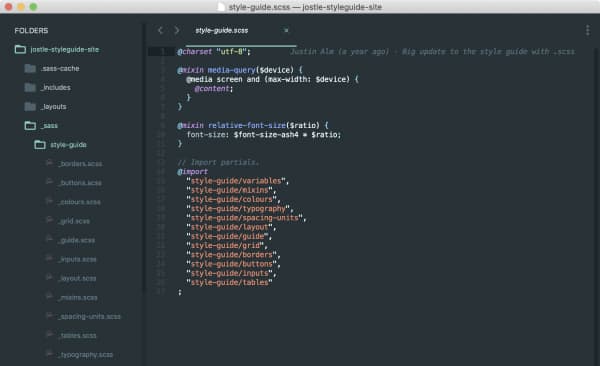
The Style Guide existed as a shared library among our Design Team in Figma. We also built a Jekyll website and deployed it to style.jostle.us. Unfortunately, that site was only accessible via Jostle’s VPN. I’ve got a fork of this project on my personal Github. That online resource was an invaluable asset for both our Design and Dev Teams. That HTML and CSS made our design system “real” as it shared the same material as our product. We used git for version control and collaborated on the project over Jostle’s Gitlabs.
Figma
Jekyll
Gitlabs
style.jostle.us
Reflection
The Style Guide proved to be very useful when designers joined Jostle’s Design Team. It empowered designers to:
Make more impactful decisions faster
Work independently was the number of projects increased
Achieve a higher level of consistency
Reduce complexity for our end users

Withthout total vertical integration, tracking changes from the Style Guide to all of the instances where styles were implemented, made for a less than perfect outcome. There were many ways to try and deal with that problem but everyone was always balancing cost vs benefit on the production pipeline.
The shared ‘human’ language of the Style Guide didn’t spread completely throughout the organization but slowly made things better. The Jostle Design Team continues to work on adoption throughout the Dev Team. Most likely, adoption will increase when a few champions integrate the Style Guide into the dev environment.
Jostle has a lean development philosophy. The Style Guide wasn’t created to go back and fix everything that was stylistically flawed. Instead, the intent was to use it moving forward on product on the roadmap. Although the full impact of the Style Guide wasn’t realized during my time at Jostle, it brought immediate benefits to the Design Team. We were able to move forward in a unified voice—communicating a shared vision for the product together.
The response
In my 15+ years in software development, a designer has never explained to this level what the style of the product should be. For a person that cares about design and consistency (but does not have your expertise) this is really huge. Thanks so much.
Darren John, Test Team Lead at Jostle